Although permanent fixtures, the poles (large square and small round) in this window are being used to the visual merchandiser’s advantage because they move the customer’s eye up and down the window display. Along with the large signage, these poles are playing with proportion in this display to grab attention. The relationship of items in the display are proportionate. There is also a balance (equal visual weight) in this window because of the three mannequins on the right and the two off to the left. The one mannequin in the corner is slightly turned to allow for customers turning toward the store to be included in seeing the display. The shoes are not just accessories, the boxed behind them adds more visual weight, therefore giving them a larger presence in the window. The spotlights are not only for aesthetic purposes, they also are illuminating each item and therefore highlighting it in the window. I enjoy this window because of the uniformity and harmony of the design principles, otherwise known as unity.
Author: paulinawietocha
Aeropostale – Eastland Mall
Because there is no background in this window, the customer is able to see into the store. The very large sale sign next to the two mannequins is how this window is using proportion. The window includes varied heights of mannequins, although there are few. The goal of this window is to get people into the store, which it does. I admit, I went in to check out the sale once I walked past this store. And the mannequins have interesting outfits displayed, which only helps. Having only two on display leaves the customer wanting more. I do enjoy the idea of one being taller (up higher) than the other because it makes a very simple window look more thoughtful. The sign itself uses repeating horizontal lines to move the eye left and right as well as off-center font to keep it carefree.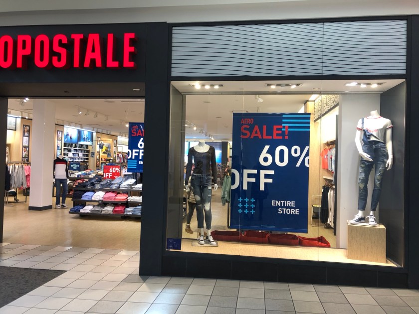
H&M – Eastland Mall
This window employs proportion at first glance; the picture of the woman is much larger than the mannequins and it draws your eye as you are walking past the storefront. Because there are more than three mannequins seen- and they are arranged in a line, with one angled, it creates a rhythm that moves the eye left and right. I like the simplicity of the blue and the contrast of the bold color against the colorful advertisement. The repetition of the mannequins is pleasant, which is interesting against the variety of dress seen in the window. Overall, there is a harmony in this window that I enjoyed.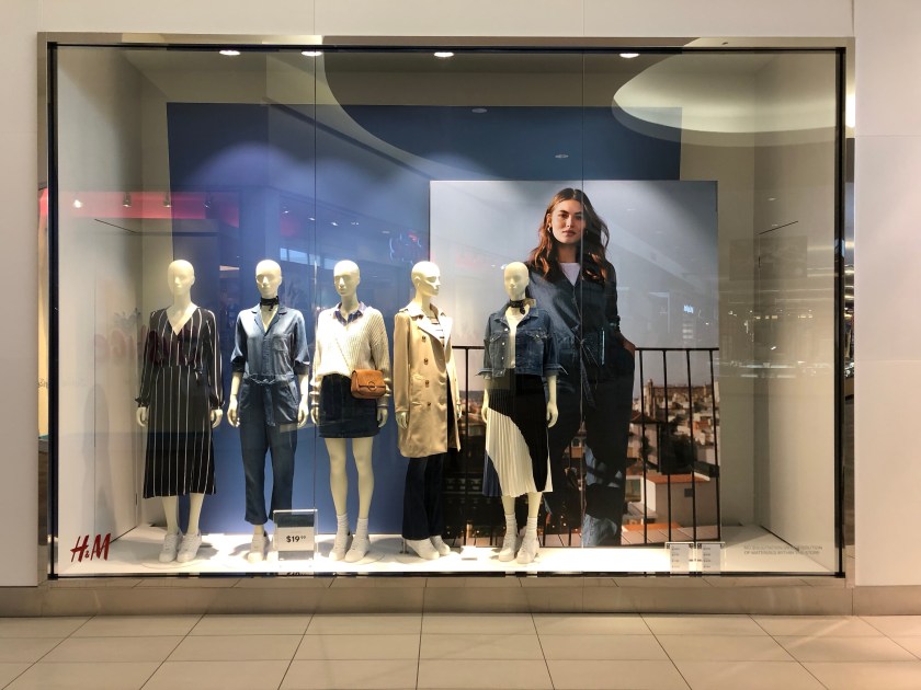
Theory
“New Year, New Arrivals” is a very neutral window that relies on rhythm as its main principle of design. Because all of the items being displayed, along with the mannequins, are in light, neutral colors I get a sense of the type of goods that are sold at this store; basics. There is no background to this window so the customer can see the similar, minimalistic, style of the store layout and brand. The “men’s” side of the display window features the same ideas, however there is a mannequin wearing a pink shirt. This contrast (emphasis), in my opinion, could have been better executed as it feels like it does not belong. It is too random and the emphasis is not enough. As a consumer, I like the outfit but as a visual retailer, I am confused. There are red signs being displayed, which are probably the focal point because they are sale signs. The pop of color introduced catches the customers eye as they walk by due to the proportion (it’s a large sign in comparison to the mannequins) and the emphasis (through contrast). Overall, there is a reason I chose to take a photo of this store because I do like the simplicity of the windows.


Stave – Uptown Normal, IL
Although this is not a clothing store, the visual display caught my eye right away! With the lights and pops of color, the merchandise was arranged in a very interesting way. Serving cheese and wine, there is not a huge push for those products, more so a feeling being evoked in the display. I feel like this says “classy” or “timeless”. I like the vertical lines created by the trees and flowers, it makes your eye go up to the signs above the windows. Similarly to the display inside Butter Twice & Again, I enjoy the varied heights of these flowers and that they are arranged in a group of three. The trees are also a threesome, which is a good number – not too little (empty) and not too much (crowded).


Whimsy – Uptown Normal, IL
This window reminded me of my bedroom. In a similar layout to my bedroom, I also have a curtain beside a color-coded rack of clothes (hanging). The outfit curated for display attracted me because of the trendy metallic purse, of course someone is going to stop to look at something shiny! Inside, I enjoyed how cozy and home-y the displays looked. I like the scarf ladder and jewelry displayed on top of dressers. Not only did it feel very casual but having the drawers open, with merchandise sticking out, made me feel right at home!


Butter Twice & Again – Uptown Normal, IL
This window was very interesting to me! I really enjoy vintage and second-hand items and the colors, textures, variety of garments displayed drew me in. The line-up of shoes toward the bottom created movement as they were all placed at an angle. As soon as I opened the door to walk into the store, I noticed a great display for the upcoming holiday, Valentine’s Day. The sign says “There’s no such thing as a perfect valentines day gi….”, meaning that you will find the perfect gift in this store. I liked that there were three mannequins featured in this display, a very pleasing number. The varying heights added visual interest and the pops of color (red) were both attractive and appropriate.


Garlic Press – Uptown Normal, IL
The interior display was much more thoughtfully designed. Not only was it visually interesting, with the varied textures and patterns, but it was also inviting. By inviting I mean that it was a lifestyle that many people would like to emulate. The exterior window was lacking, in my opinion. I did enjoy the thoughtfulness of the varied placement of the boxes, including some unboxed items on the floor of the display. I do feel, however, that the two hanging aprons were not enough. There should have been more color, texture, or attention toward the top of the window. Even though the majority of the items were placed on the ground, that is where the eye was drawn to because of the orange color of the merchandise. A simple table (varied heights) would have made a world of a difference.

Outside Window

Interior Display
The Journey Begins
Thanks for joining me!
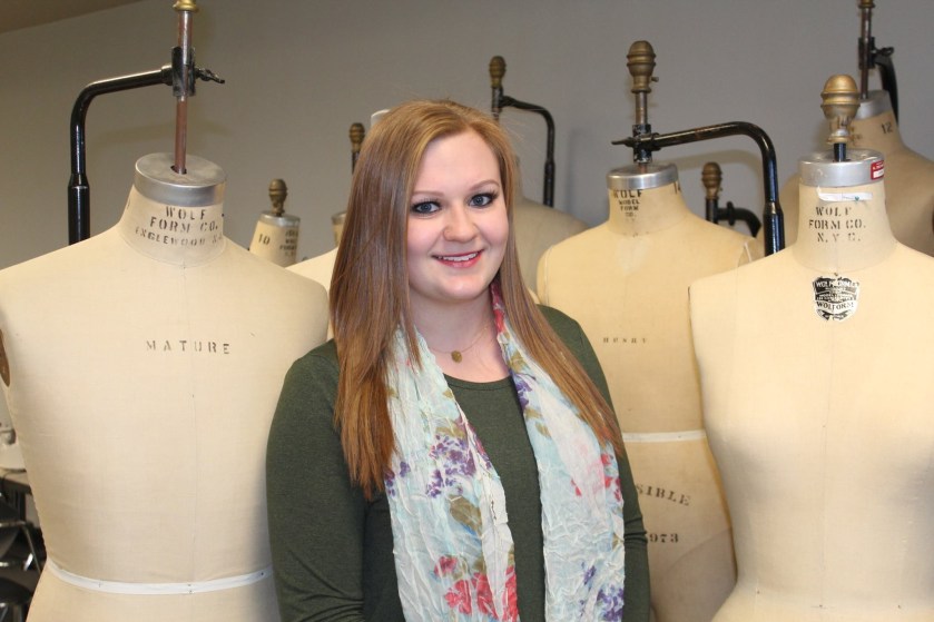
Throughout the Spring 2019 semester, I will be exploring fashion promotion by way of analyzing window displays. Below is a picture of me, just so you can put a face to my writing. A little more about me: I am a graduate student at Illinois State University, with an emphasis in Fashion Design and Merchandising. I hope you enjoy my blog!