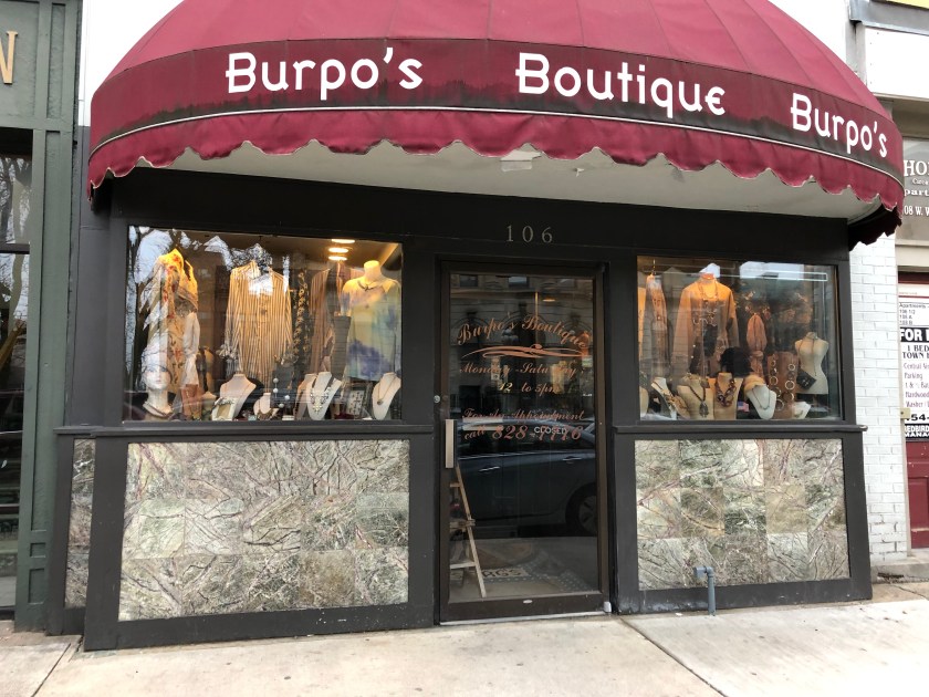
Because this boutique only has small windows to work with, due to the older building it’s located in, there is a lot of merchandise crammed into the display. It seems as though only tops and accessories are being displayed, so I wonder if that is the only merchandise available for sale or if this is due to the lack of space in the window. With all of the different types of mannequins and necklace stands in the display, I kind of wonder if this is a secondhand store. Something the visual merchandiser, if there was one, could have done better was to display LESS and on uniform mannequins/stands. This would have made the window look more cohesive and less thrown together. I am confused on the placement of the necklace displays as they seem to be facing random directions, not necessarily on purpose. It also bothers me that the jewelry being displayed is on one level, as I feel there would be more visual interest if the items were at varying heights. Overall, this window is not successful because it does not make me want to go in the store. If the inside of the store is anything like the window, it is cluttered, random. Another thing I would like to point out is the way the lighting is hitting the tops in the display. First of all, the lighting is much too yellow and makes the clothing look discolored. Secondly, It should be on the jewelry as well instead of pointing awkwardly at the blouses hanging in the background. Because the elements/principles of design are not being applied, my eye has a hard time to travel through the window. There is also no distinct focal point to catch my attention on the street, so I would probably walk right past this store. 
