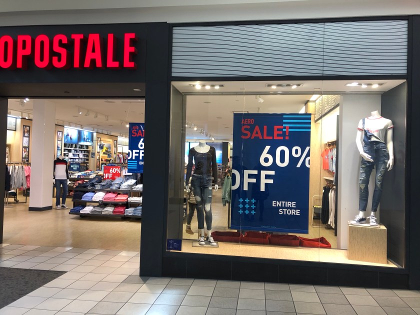
Because there is no background in this window, the customer is able to see into the store. The very large sale sign next to the two mannequins is how this window is using proportion. The window includes varied heights of mannequins, although there are few. The goal of this window is to get people into the store, which it does. I admit, I went in to check out the sale once I walked past this store. And the mannequins have interesting outfits displayed, which only helps. Having only two on display leaves the customer wanting more. I do enjoy the idea of one being taller (up higher) than the other because it makes a very simple window look more thoughtful. The sign itself uses repeating horizontal lines to move the eye left and right as well as off-center font to keep it carefree.